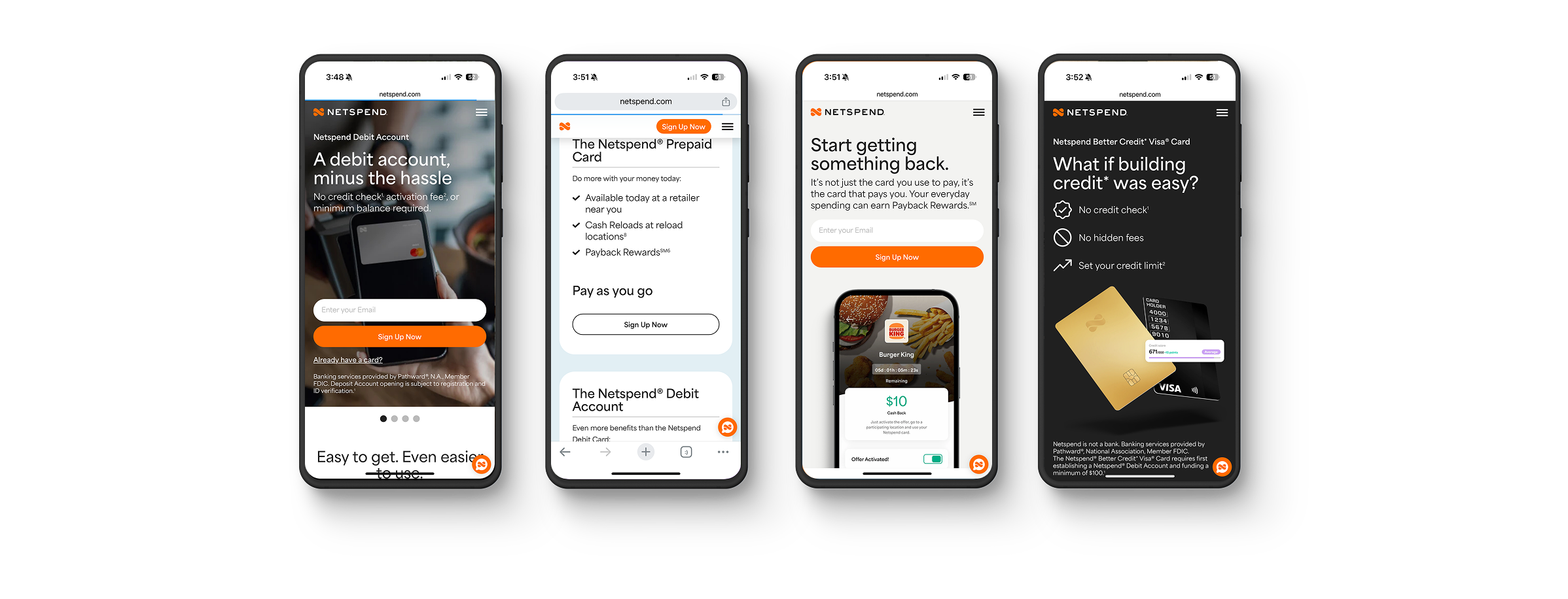
Netspend Website
UI/UX, Copywriting
After years of layering new products with their own branding and accumulating excessive information and pages, the website had become cluttered and inconsistent. A streamlined, more intuitive experience was essential to bring clarity, cohesion, and simplicity to the brand.
-

Before
The previous design had a high bounce rate (47%), slow load times, and signs of user frustration, with rage clicks being a major issue. Visitors weren’t exploring the site as much as expected, leading to lower engagement and missed opportunities.
-

After
The goal was to create a clean and intuitive design—one that enhances the user experience, drives engagement, and improves overall site performance. Intentional updates were made throughout the site to better distinguish products and highlight their unique differences.
-

Before
The overall design of the Netspend website was a disjointed experience and the branding was inconsistent and confusing.
-

After
The design emphasizes a cohesive, modern, and approachable aesthetic, ensuring consistency across all touchpoints. Every element was carefully considered to create a seamless experience that feels visually unified, inviting, and easy to navigate.
-

Before
The copy was lengthy and lacked personality. The tone was straightforward but needed a conversational touch to make the perks feel more exciting and relatable.
-

After
Simplified and more human, the design delivers a clear visual identity and a conversational tone, making the experience feel engaging, relatable, and trustworthy.

The redesign didn't just enhance aesthetics. It created a high-performing, user-friendly, and engaging experience that keeps visitors on the site longer, interacting more, and leaving more satisfied.
Performance and user engagement saw dramatic improvements across the board. The bounce rate dropped significantly—sitewide by 30% and the homepage by a staggering 64%, bringing it well below the industry average. Visitors are engaging more than ever, with a 13% increase in engaged sessions and a 26% boost in engagement rate. The homepage saw the most impact, with a 34% rise in engaged sessions and a 57% surge in engagement rate, reaching an impressive 83%, well above the industry standard.
From a usability standpoint, active clicks skyrocketed by 170%, indicating users are exploring more, while frustration-driven rage clicks plummeted by 62%. On the technical side, the site now loads 45% faster, delivering a smoother experience. Google Lighthouse scores are 20%+ ahead of competitors, outperforming key industry players like Chime, Revolut, and Green Dot.